In Progress: Fineliner Only Inking of a Medieval Elf
What’s being inked today?
Good afternoon! Today’s drawing session involved taking one of my comfy-tea-time sketches from my sketchbook and turning it into a watercolour and ink illustration. This time the sketch in question was of an elven character, wearing a warm many layered dress and bedecked in flowers. The outfit was inspired by some of the many studies I love to do using the Medieval Costumes reference pack by Johanna Rupprecht. The pack is full of outfits from the Landshut Wedding re-enactment that takes place in Germany every four years, where historical accuracy is sought after for the costuming.
I love to share the resources I use in case they are helpful to someone else out there, so if you are interested check out her reference packs here: Johanna Rupprecht. If you’re looking for some free environment reference, she also has packs of Taiwan reference and Yosemite reference and those two are free! I don’t have any affiliation with the packs or the creator, I’m just sharing what I use in my own art practice.
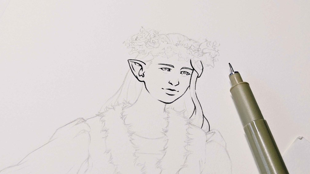
Beginning to ink the line-art on the character illustration, with the pencilled lines still visible.
I completed the pencilling in a previous drawing session, leaving the promise of ink to the next session. Sometimes saving an enjoyable part of the process makes me want to jump in all the more the following day. My surface of choice this time around is (are you ready? this is a long one!) the Saunders Waterford hot press natural white 140lb cotton watercolour paper (…and breathe). I have a few watercolour papers I reach for on different occasions. In this instance, I wanted to use a very smooth paper.
The Smoothest Hot Press Paper
For those that aren’t aware hot press is the smoothest on the scale of watercolour paper texture, with cold press having more texture, and then the most textured paper being classified as rough. Despite hot press being considered the smoothest, the amount of texture or lack thereof can vary quite wildly brand to brand. I haven’t been able to try an extensive list of brands, but the ones I have found to have the smoothest hot press paper are Saunders Waterford, Arches, and Fluid100. The roughest hot press paper I have come across so far is by Baohong in both their Academy and Master’s Choice lines. Maybe I should do a post comparing the texture of them at some point?
For the type of effects I want to do in this character illustration I want the smoothest of the smooth papers. Sometimes after applying all of the watercolour layers I like to add colour pencil. With that combination of mediums I find the most satisfaction in using very smooth paper, which allows me more room in creating smooth or rough textures with the colour pencils. I have tried with the rougher hot press papers before, but it just doesn’t feel as nice to me in the process or in the result.

Ink line textures and variation on the clothing folds and foliage.
Illustrating Using Only One Fineliner
As a whole I keep my inking kit quite minimal, but for this I only reached for one pen in the pencil case. I have a love for both the line variation found in brush pens and flexible nibs as well as the textures that can be produced using fineliners and standard nibs. Typically I will reach for what I need to produce the textures I want, but sometimes I like to let one tool shine on its own. Today was all about letting my old 0.25 mm micron shine. It’s been a trustworthy companion, as is evidenced by all the text being rubbed off the body of the pen. You’re just going to have to trust me that it’s 0.25 mm! Despite how long I have used this pen, and the many illustrations it has gone through, the ink is still flowing and the tip is still mostly unworn. In school I used to have a terrible problem with wearing down fineliners until the rounded tip went flat, due to how hard I pressed to write. I seem to have avoided the same fate with my drawing habits (and current writing habits for that matter).
And that’s all for now, lovelies.